Basic Color Theory For Graphic Design
The fundamentals of understanding color theory
olor theory is both the science and art of using color. It explains how humans perceive color; and the visual effects of how colors mix, match or contrast with each other. Color theory also involves the messages colors communicate; and the methods used to replicate color.
In color theory, colors are organized on a color wheel and grouped into 3 categories: primary colors, secondary colors and tertiary colors. More on that later.

So why should you care about color theory as an entrepreneur? Why can’t you just slap some red on your packaging and be done with it? It worked for Coke, right?
Color theory will help you build your brand. And that will help you get more sales. Let’s see how it all works.
Understanding color
–
People decide whether or not they like a product in 90 seconds or less. 90% of that decision is based solely on color.
Color is perception. Our eyes see something (the sky, for example), and data sent from our eyes to our brains tells us it’s a certain color (blue). Objects reflect light in different combinations of wavelengths. Our brains pick up on those wavelength combinations and translate them into the phenomenon we call color.
When you’re strolling down the soft drink aisle scanning the shelves filled with 82 million cans and bottles and trying to find your six-pack of Coke, what do you look for? The scripted logo or that familiar red can?
People decide whether or not they like a product in 90 seconds or less. 90% of that decision is based solely on color. So, a very important part of your branding must focus on color.
RGB: the additive color mixing model
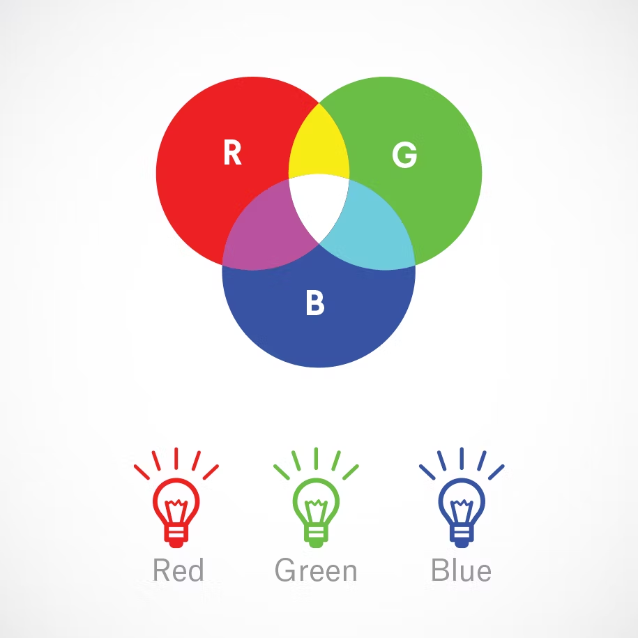
Humans see colors in light waves. Mixing light—or the additive color mixing model—allows you to create colors by mixing red, green and blue light sources of various intensities. The more light you add, the brighter the color mix becomes. If you mix all three colors of light, you get pure, white light.
TVs, screens and projectors use red, green and blue (RGB) as their primary colors, and then mix them together to create other colors.
Why should you care?
Let’s say you have a very distinct brand with a bright yellow logo. If you post the logo on Facebook, Twitter or your website and don’t use the correct color process, your logo will appear muddy instead of that bright yellow. That’s why, when working with files for any screen, use RGB, not CMYK.
CMYK: the subtractive color mixing model
Any color you see on a physical surface (paper, signage, packaging, etc.) uses the subtractive color mixing model. Most people are more familiar with this color model because it’s what we learned in kindergarten when mixing finger paints. In this case, “subtractive” simply refers to the fact that you subtract the light from the paper by adding more color.
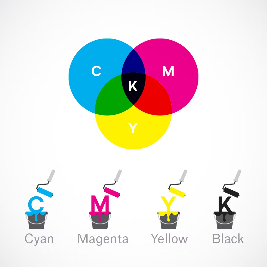
Traditionally, the primary colors used in subtractive process were red, yellow and blue, as these were the colors painters mixed to get all other hues. As color printing emerged, they were subsequently replaced with cyan, magenta, yellow and key/black (CMYK), as this color combo enables printers to produce a wider variety of colors on paper.
Why should you care?
You’ve decided to print a full-color brochure. If you’re investing all that money into your marketing (printing ain’t cheap!), you expect your printer is going to get the colors right.
Since printing uses the subtractive color mixing method, getting accurate color reproduction can only be achieved by using CMYK. Using RGB will not only result in inaccurate color, but a big bill from your printer when you’re forced to ask them to reprint your entire run.
The color wheel
–
I don’t know about you, but when I was a kid, the best part about going back to school in the fall was getting that new, pristine 64-count box of Crayola crayons. The possibilities seemed endless. Until I’d inevitably lose the black crayon.
Understanding the color wheel and color harmonies (what works, what doesn’t and how color communicates) is just as exciting as that new box of crayons. No really.
Being able to understand the terms and processes that go along with color will help you knowledgeably communicate your vision with your designer, printer, or even (maybe) an Apple Store Genius.
Color wheel basics
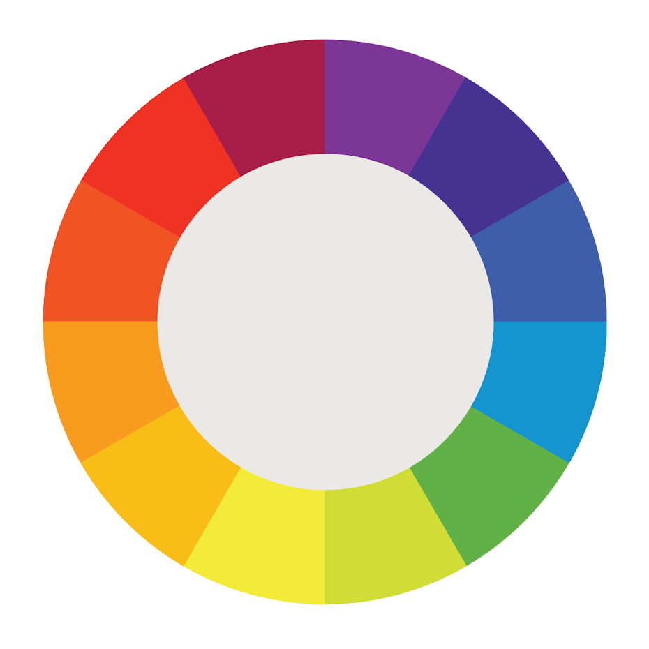
The first color wheel was designed by Sir Isaac Newton in 1666 so it absolutely predates your introduction to it in kindergarten. Artists and designers still use it to develop color harmonies, mixing and palettes.
The color wheel consists of three primary colors (red, yellow, blue), three secondary colors (colors created when primary colors are mixed: green, orange, purple) and six tertiary colors (colors made from primary and secondary colors, such as blue-green or red-violet).
Draw a line through the center of the wheel, and you’ll separate the warm colors (reds, oranges, yellows) from cool colors (blues, greens, purples).
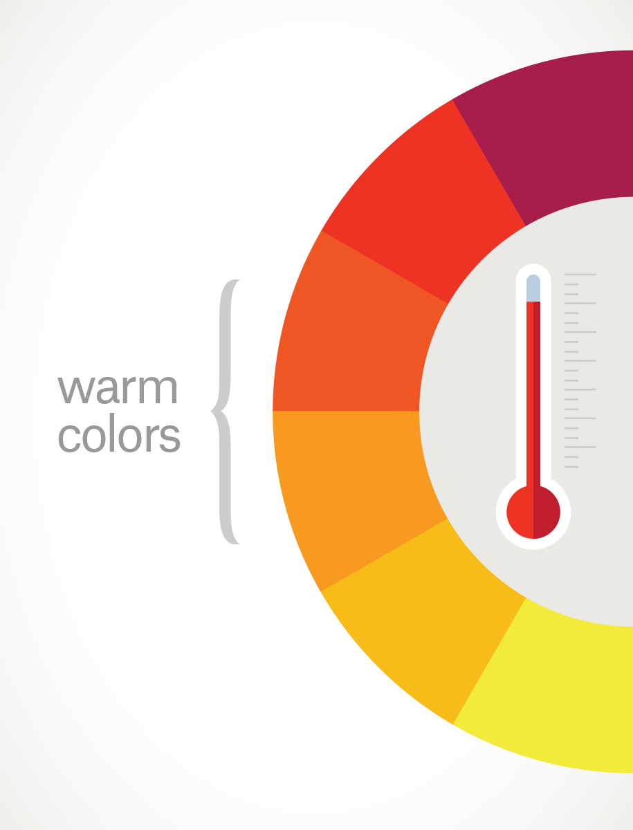
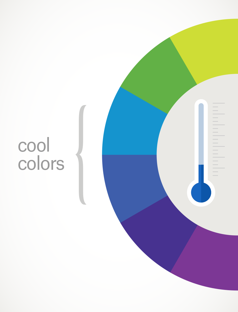
Warm colors are generally associated with energy, brightness, and action, whereas cool colors are often identified with calm, peace, and serenity.
When you recognize that color has a temperature, you can understand how choosing all warm or all cool colors in a logo or on your website can impact your message.
Hue, shade, tint and tone
Let’s go back to that 64-pack of crayons from our first day of school. (Remember “raw umber”? What is an umber anyway, and is it actually better raw than cooked?) Anyway, you might be wondering, how we got from the twelve colors on our original color wheel to all those crayons? That’s where tints, shades, and tones come in.
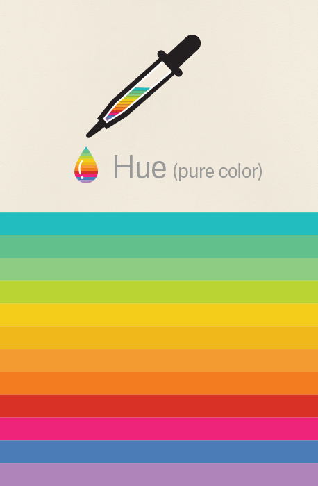

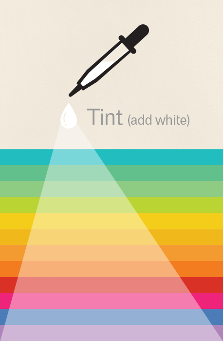
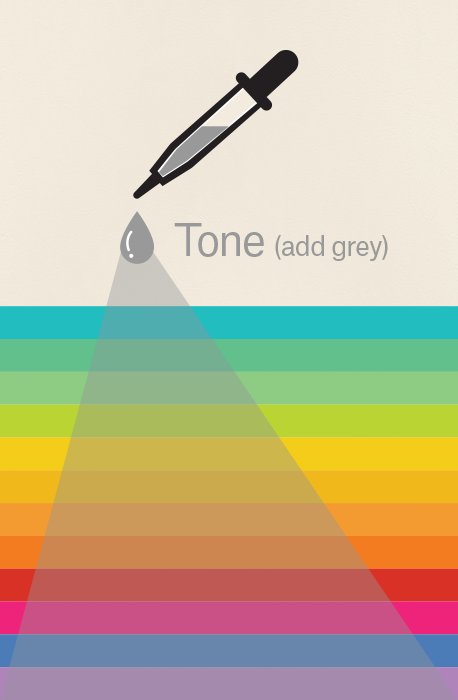
Simply put, tints, tones and shades are variations of hues, or colors, on the color wheel. A tint is a hue to which white has been added. For example, red + white = pink. A shade is a hue to which black has been added. For example, red + black = burgundy. Finally, a tone is a color to which black and white (or grey) have been added. This darkens the original hue while making the color appear more subtle and less intense.
Color schemes
Let’s talk schemes… (And not the kind that cartoon villains concoct. Bwahaha!) We’re talking color schemes. Using the color wheel, designers develop a color scheme for marketing materials.

Complementary colors
Complementary colors are opposites on the color wheel—red and green, for example.
Because there’s a sharp contrast between the two colors, they can really make imagery pop, but overusing them can get tiresome. Think any shopping mall in December. That being said, using a complementary color scheme in your business marketing offers sharp contrast and clear differentiation between images.
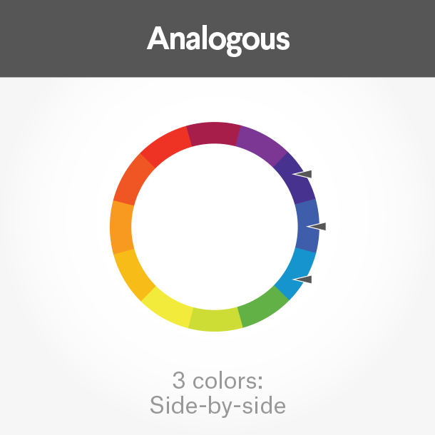
Analogous colors
Analogous colors sit next to one another on the color wheel—red, orange and yellow, for example. When creating an analogous color scheme, one color will dominate, one will support and another will accent. In business, analogous color schemes are not only pleasing to the eye, but can effectively instruct the consumer where and how to take action.

Comments
Post a Comment